 Episode
· 01:06
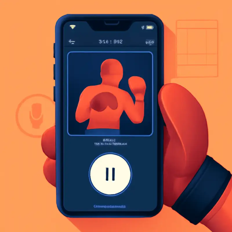
Welcome back to UX Minute. Today we’re talking about why “details were everything” in one solo developer’s fitness app. After three years of growth, he redesigned the main workout screen to move the pause button from a cluttered top bar to a big, easy-to-reach icon at the bottom. Users loved it—until real boxers tried it for the first time. More than 70 percent of new users tapped the screen expecting it to pause, learned nothing happened, then finally hit the pause button. He admits he “vastly underestimated the impact” of not adding the simple tap-to-pause feature that video and fitness apps all use. When you’re sweating through jab-cross combinations, “you don’t want to struggle to pause, especially with boxing gloves on.” Hindsight taught him that “it should be exactly the way you expect it to be, no friction.” Tracking user behavior and responding to feedback saved the day—and made the app feel truly seamless.
Link to Article
Listen to jawbreaker.io using one of many popular podcasting apps or directories.